A rebrand that puts first aid back where it belongs: in people’s hands
From dusty certificate to national movement
Het Oranje Kruis is the Dutch authority on first aid. Since 1909, they’ve certified millions. But in recent years, that authority had become… well, a little too authoritative. Complicated rules, outdated exams, little connection to real life.
Time for a reset.
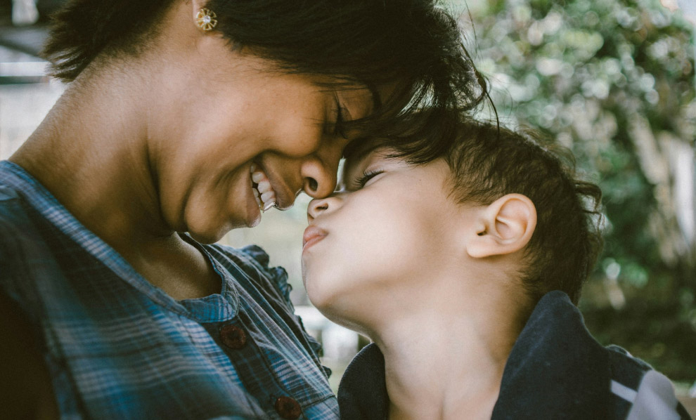
We helped Het Oranje Kruis reimagine itself — from a rigid institution into a modern knowledge hub. More accessible. More practical. More human. Because first aid shouldn’t be hard. It should be second nature.
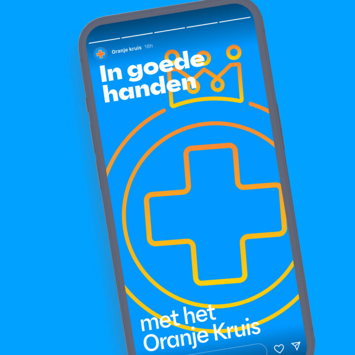
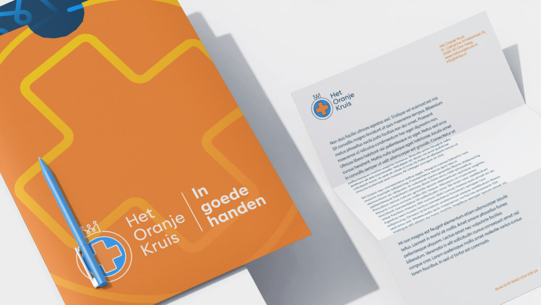
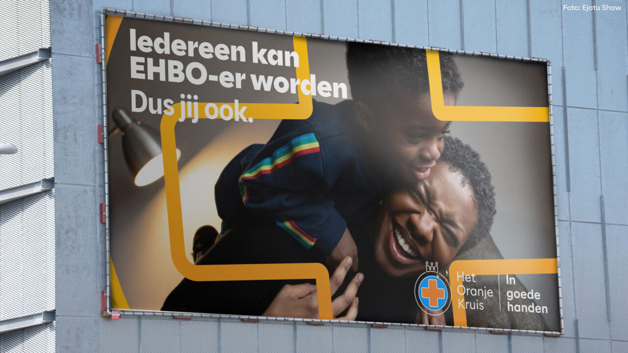
A bold new promise: In good hands
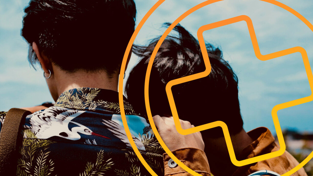
Everything we built hangs on one clear message: In good hands. A line with three meanings. The injured are in good hands with trained first aiders. The public and professionals are in good hands with Het Oranje Kruis. And first aid itself? Safe in the hands of a future-ready organization.
We turned that into a full brand strategy: clear positioning, sharp messaging, human values, and a confident tone of voice. It’s not just branding — it’s direction.
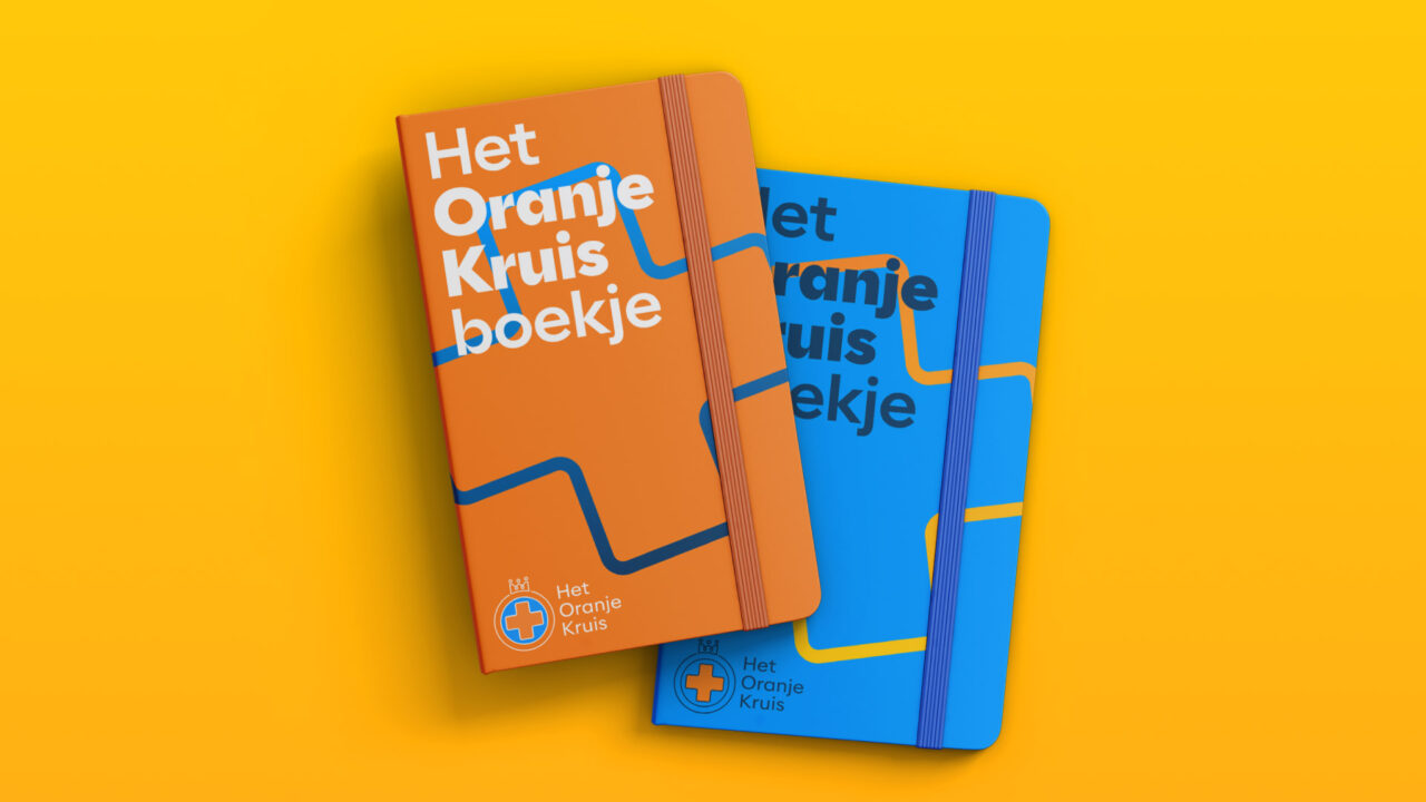
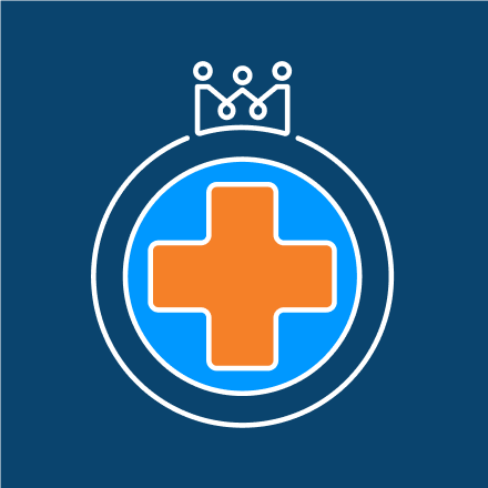
We softened the cross. Warmed up the palette. Used typography that feels as smart as it is kind. Everything about the new identity says: this is for you. For schools, sports clubs, parents, colleagues — anyone who might ever need to help.
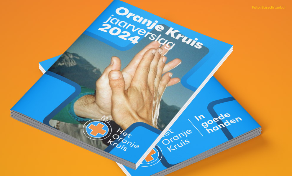
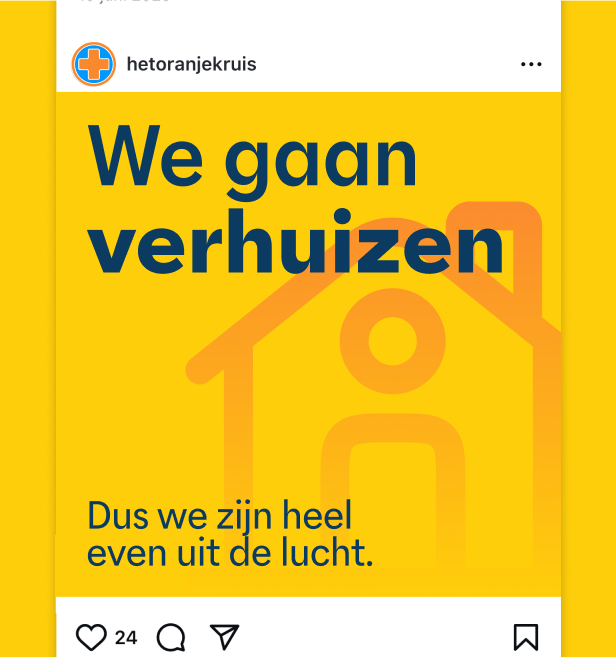
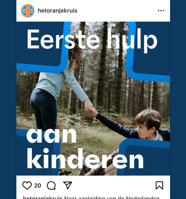
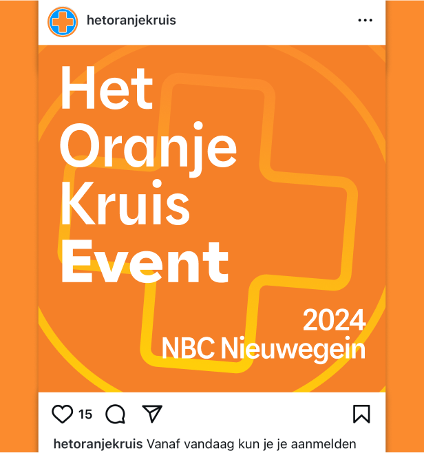
The new design system works across every touchpoint: social, print, campaigns, course materials. Simple. Flexible. Recognizable.
First aid, for everyone
Het Oranje Kruis has one goal: by 2028, every household in the Netherlands should have someone who knows how to give first aid.
That’s eight million people.
This rebrand is how they’ll get there. And we’re proud to have helped put the future of first aid — and the people it serves — in good hands.